A New Nation, Conceived in…
Albuquerque
Just wanted to drop you a note about the print magazine revamp: splendid!
RUSS HALL
Jamaica Plain, Mass.
Like the new design: easier to read.
MARY ANN KOPYDLOWSKI
Chicago
Please increase the font size! The shrunken type is nearly unreadable for anyone on the downside of 50.
ADAM L. SCHEFFLER
Santa Barbara, Calif.
I hate the new format. I don’t think I’ll renew.
RONALD W. TOBIN
San Antonio
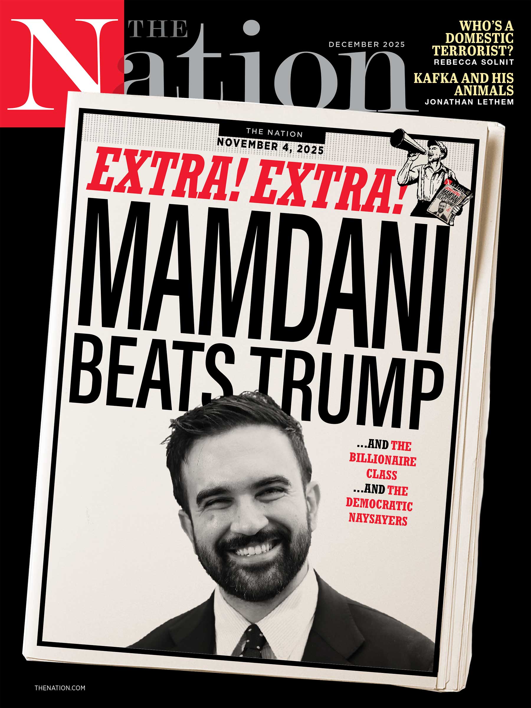
I was thrilled to see the new look. Many of the design choices resemble elements from The Nation‘s history, from the 1920s onward. I do have one complaint: the pictures are often ruined by the ads on the other side of the page.
REGIS L. ROBERTS
Etna, N.Y.
The redesign will take some getting used to. I think I like most of it, but I was disappointed not to see that little nod to the magazine’s history, “The Nation since 1865,” at the top of page 3.
WILLIAM BLACKWELL
Portland, Ore.
Does it merely appear that the ad on the “Letters” page cuts into the amount of content? And with “Noted,” you have instituted one of my least favorite design features: dropping an article into the middle of another without creating a jump.
BILL MICHTOM
Minneapolis
I tend to resist change, but the new look is pleasing to the eye; and the clarity of the new paper is easier on aging eyes. Congratulations to the designers.
GEORGE MUELLNER
Brooklyn, N.Y.
I guess now we know what Karl Rove is doing in retirement: whispering design advice to The Nation‘s art director. How else can I explain the sad little thing that showed up in my mail this week? Rove’s still brilliant, persuading you to see “lively” and “distinctive” in this flaccid trade-mag layout and Captain Kirk typography. Thank you, at least, for offering me a teaching tool for my classes at Pratt. The contrasts between the stodgy old Nation, the clear, strong hipness of the Scott Stowall-era magazine and this limp Nation Lite are fascinating. I can only hope Rove won’t be allowed near the writers.
ROB KIMMEL
Oakland, Calif.
I don’t know if The Nation‘s new redesign will get as much negative feedback as the last one did. I think The Nation should be judged not by the color of its copy but by the content of its characters.
AARON PRIVEN
Fort Bragg, Calif.
What a surprise–the makeover! I’ve been very comfortable with your old format over the years, yet I like the new one. It will take time for my 90-plus years to adapt. Your design seems to have been done with a view to reader comfort, not like so many remakes, which apparently are for the satisfaction of the designers.
HOWARD ENNES
“The Nation since 1865″ (inadvertently dropped in the heat of redesign implementation) is back. The new type (Janson) is actually a half-point larger than the old type (the strokes are finer, which makes it easier to read: less ink, more air), although the space between the lines is a quarter-point narrower. “Noted” expands and contracts and travels, depending on variables. We were pleased with the largely positive response to the redesign and thank our readers for their comments and suggestions. –The Editors


